The history of global economic inequality
The inequality in people’s living conditions across the world is extremely large. How did the world become so unequal, and what can we expect for the future?
This article was originally published in 2017. The data shown and discussed in the text are therefore not always the latest estimates. For more up-to-date data, see our Data Explorers on Poverty and Inequality.
The inequality in people’s living conditions today is extremely large. The panel of charts below shows how large these differences are, and how the inequality in 12 important measures of living standards maps onto the economic inequality in the world.
What is most important for how healthy, wealthy, and educated you are is not who you are, but where you are. This was the point I made in another article. A person’s knowledge, skills, and how hard they work all matter for whether they are poor or not – but all these personal factors together matter less than the one factor that is entirely outside of a person’s control: whether they happen to be born into a large, productive economy or not.
How did we get here? How did the world become so unequal, and what can we expect for the future?
Global divergence followed by convergence
The chart shows estimates of the distribution of annual income among all world citizens over the last two centuries.
To make incomes comparable across countries and time, daily incomes are measured in international-$ — a hypothetical currency that would buy a comparable amount of goods and services that a U.S. dollar would buy in the United States in 2011 (for a more detailed explanation, see here).
The distribution of incomes is shown at 3 points in time:
- By 1800, few countries had achieved economic growth. The chart shows that most of the world lived in poverty with an income similar to today's poorest countries. At the beginning of the 19th century, the vast majority—roughly 80%—of the world lived in material conditions that we would refer to as extreme poverty today.
- In 1975, 175 years later, the world had changed—it had become very unequal. The world income distribution was 'bimodal', with the two-humped shape of a camel: one hump below the international poverty line and a second hump at considerably higher incomes. The world had divided into a poor, developing world and a developed world more than 10-times richer.
- Over the following 4 decades, the world income distribution has again changed dramatically. There has been a convergence in incomes: in many poorer countries, especially in South-East Asia, incomes have grown faster than in rich countries. While enormous income differences remain, the world can no longer be neatly divided into 'developed' and 'developing' countries. We have moved from a two-hump to a one-hump world. And at the same time, the distribution has also shifted to the right—the incomes of many of the world's poorest citizens have increased, and extreme poverty has fallen faster than ever before in human history.
Global income inequality increased for two centuries and is now falling
This visualization shows the distribution of incomes between 1988 and 2011. The data was compiled by the economists Branko Milanovic and Christoph Lakner.3
To see the change over time, select the years above the distribution.
The previous visualization, which showed the change from 1820 to the year 2015, is based on estimates of inflation-adjusted average incomes per country (GDP per capita) and a measure of income inequality within a country only. It gives us a rough idea of how the distribution of incomes changed, but it is not very detailed or precise. In contrast to this, the work by Branko Milanovic and Christoph Lakner is based on much more detailed household survey data. This data measures household income at each decile of the income distribution, and the two authors used this information to arrive at the global income distribution. The downside of this approach is that we can only go as far back in time as household surveys were conducted in many countries around the world.
The visualization shows the end of the long era in human history in which global inequality was increasing. Starting with industrialization in North-Western Europe, incomes in this part of the world started to increase while material prosperity in the rest of the world remained low. While some countries followed European industrialization – first Northern America, Oceania, and parts of South America and later Japan and East Asia – other countries in Asia and Africa remained poor. As a consequence of this, global inequality increased over a long period. Only in the period shown in this visualization did this change: with rapid growth in much of Asia and Latin America, the global distribution of incomes became less unequal. The incomes of the poorer half of the world population rose faster than the incomes of the richer half.
A look into the future of global inequality
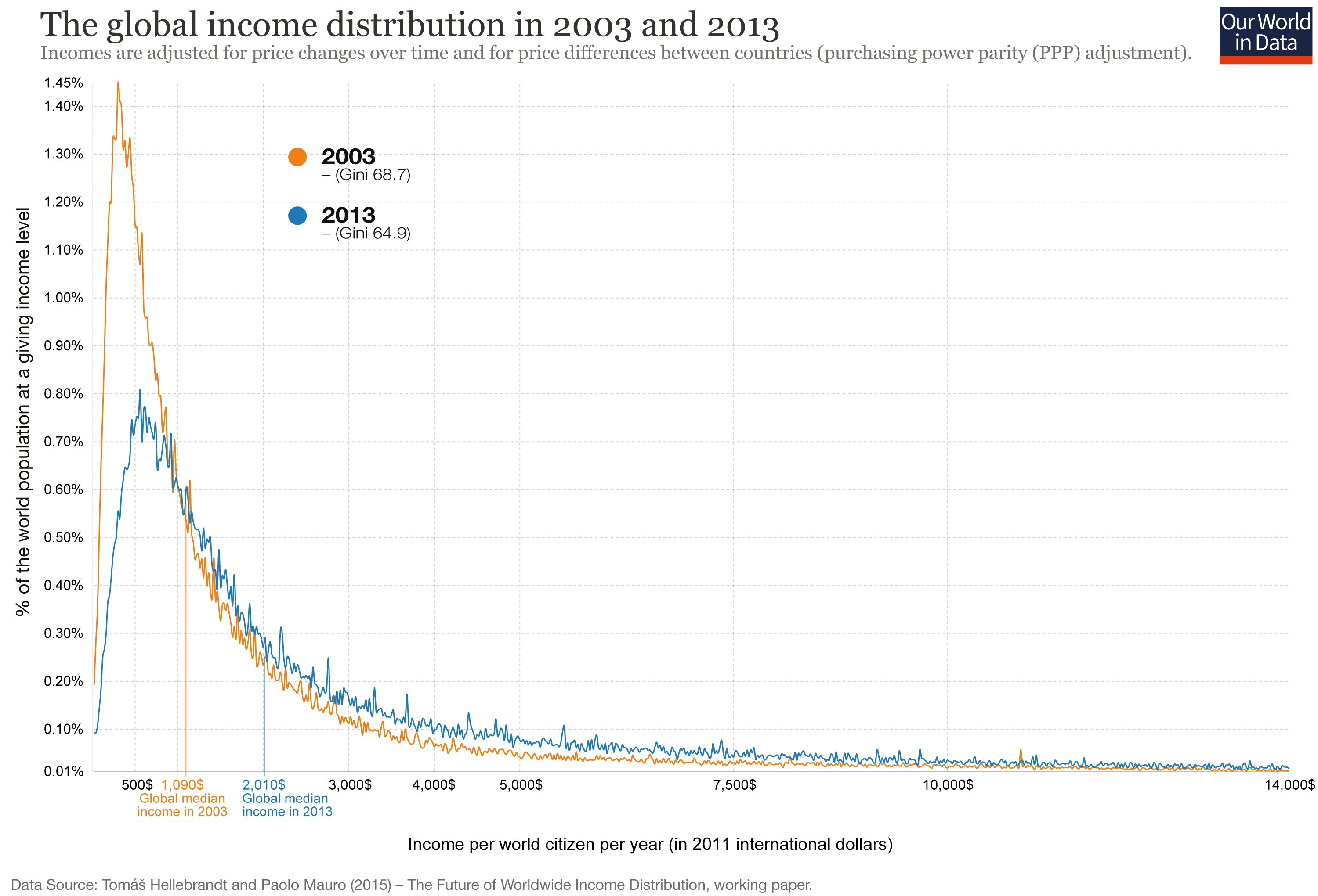
This visualization shows how the global income distribution has changed over the decade up to 2013. Tomáš Hellebrandt and Paolo Mauro, the authors of the paper4 from which this data is taken, confirm the finding that global inequality has declined but remains very high: the Gini coefficient of global inequality has declined from 68.7 to 64.9.
The visualizations above show the income distribution on a logarithmic x-axis. This chart, in contrast, plots incomes on a linear x-axis and thereby emphasizes how very high global inequality still is: The bulk of the world population lives on very low incomes, and the income distribution stretches out very far to the higher incomes at the right-hand side of the chart; incomes over 14,000 international-$ are cut off as they would make this chart with a linear x-axis unreadable.
A second positive global development shown in this chart is the rise of the global median income. In 2003 half of the world's population lived on less than 1,090 international-$ per year, and the other half lived on more than 1,090 international-$. This level of global median income has almost doubled over the last decade and was 2,010 international-$ in 2013.
Finally, the authors also dare to project what global inequality will look like in 2035. Assuming the growth rates shown in the insert in the top-right corner, the authors project global inequality to decline further and to reach a Gini of 61.3. At the same time, the incomes of the world's poorer half would continue to increase significantly, so that the global median income could again double and reach 4,000 international-$ in 2035.
If you are looking for a visualization of only the observed global income distribution in 2003 and 2013, you can find it here.
How global inequality has changed from 2003 to 2013
The following visualization offers an alternative view of the data by Hellebrandt and Mauro4 shown in the chart before.
The chart shows the yearly disposable income for all world citizens in both 2003 and 2013. On the x-axis, you see the position of an individual in the global distribution of incomes. On the logarithmic y-axis, you see the annual disposable income at that position.
The increase in prosperity—and decrease in poverty—is substantial. The income cut-off of the poorest 10% has increased from 260 international-$ to 480 international-%, and the median income has almost doubled from 1,100 international-$ to 2,010. Global mean income in 2013 was 5,375 international-$.5
At the same it is still the case, as emphasized before, that incomes are very low for most people in the world.
Global income inequality is very high and will likely stay high for a long time
The visualization presents the same data in the same way, except that the y-axis is now not logarithmic but linear. This perspective shows the still very high level of global inequality even more clearly.
The previous and the following visualization show how high global income inequality is. The cut-off to the richest 10% of the world in 2013 was 14,500 int-$; the cut-off for the poorest 10% was 480 int-$. The ratio is 30.2.
While global inequality is still very high, we live in a period of falling inequality. In 2003, this ratio was 37.6. The Gini coefficient has also fallen from 68.7 to 64.9.
Taking the historical experience as a guide for what is possible in the future, we have to conclude that global inequality will remain high for a long time. To understand this, we can ask how long it would take for those with incomes at the poorest 10% cutoff to achieve the current incomes of the richest 10% cutoff (14,500 international-$). This income level is roughly the level of GDP per capita above which the extreme poverty headcount gets close to 0% for most countries (see here).
Even under a very optimistic scenario, it will take several decades for the poorest regions to reach the income level of the global top 10%.
2% is roughly the growth rate that the richest countries of today experienced over the last decades (see here). We have seen that poorer countries can achieve faster growth, but we have not seen growth rates of more than 6% over a time frame as long as necessary to reach the level of the global 10% in such a short time. If the past is a good guide for the future, the world will likely be highly unequal for a long time.
How long does it take for incomes to grow from 480 int-$ to 14,500 int-$?
| 2% growth | 172.1 years |
| 4% growth | 86.9 years |
| 6% growth | 58.5 years |
| 8% growth | 44.3 years |
| 10% growth | 35.8 years |
Inequality within countries and inequality between countries
Global inequality is driven by changes in both the inequality within countries, and the inequality between countries. This visualization shows how both of these changes determine the changing global inequality.
- Inequality within countries followed a U-shape pattern over the 20th century.
- Inequality between countries increased over 2 centuries and peaked in the 1980s, according to the data from Bourguignon and Morrison. Since then, inequality between countries has declined.
As is shown in this visualization, the inequality of income between different countries is much higher than the inequality within countries. The consequence of this is that the trend of global inequality is very much driven by what is happening to the inequality between countries.

Endnotes
I have taken the data for the visualization of the world income distribution in 1820, 1970, and 2000 from van Zanden, J.L., et al. (eds.) (2014), How Was Life?: Global Well-being since 1820, OECD Publishing. Online here. The plotted data is interpolated using a Cardinal spline.
The data is originally from the Clio-Infra database here.
The data are produced by Ola Rosling and published on the website of Gapminder.
You can explore the Gapminder visualization of the income distributions of all countries in their interactive tool here. Regarding the construction of the data, Hans and Ola Rosling note the following here: “This graph is constructed by combining data from multiple sources. In summary, we take the best available country estimates for the three indicators: GDP per capita, Population, and Gini coefficient (a measure of income inequality). With these numbers, we can approximate the number of people at different income levels in every country. We then combine all these approximations into a global pile using the method described below under The Adjusted Global Income Scale.”
The data was made available to Our World In Data by the two authors. The data up to 2008 is published with the main publication Milanovic and Lakner (2015) –Global Income Distribution. Available online at the World Bank: http://elibrary.worldbank.org/doi/abs/10.1596/1813-9450-6719.
The data source is: Hellebrandt, Tomas and Mauro, Paolo (2015) – The Future of Worldwide Income Distribution (April 1, 2015). Peterson Institute for International Economics Working Paper No. 15-7. Available at SSRN or http://dx.doi.org/10.2139/ssrn.2593894.
We thank the authors for making the data available for this data visualization.
Note that global GDP per capita in 2013 was around 14,000 international-$ and substantially higher than mean disposable income from household-level surveys at 5,375 international-$.
We discuss the reasons for this discrepancy here. See also the Appendix of the original publication for a longer explanation.
Cite this work
Our articles and data visualizations rely on work from many different people and organizations. When citing this article, please also cite the underlying data sources. This article can be cited as:
Max Roser (2017) - “The history of global economic inequality” Published online at OurWorldinData.org. Retrieved from: 'https://archive.ourworldindata.org/20260518-095641/the-history-of-global-economic-inequality.html' [Online Resource] (archived on May 18, 2026).BibTeX citation
@article{owid-the-history-of-global-economic-inequality,
    author = {Max Roser},
    title = {The history of global economic inequality},
    journal = {Our World in Data},
    year = {2017},
    note = {https://archive.ourworldindata.org/20260518-095641/the-history-of-global-economic-inequality.html}
}
Reuse this work freely
All visualizations, data, and articles produced by Our World in Data are completely open access under the Creative Commons BY license. You have the permission to use, distribute, and reproduce these in any medium, provided the source and authors are credited.
The data produced by third parties and made available by Our World in Data is subject to the license terms from the original third-party authors. We will always indicate the original source of the data in our documentation, so you should always check the license of any such third-party data before use and redistribution.
All of our charts can be embedded in any site.