Period versus cohort measures: what’s the difference?
What do the terms “period” and “cohort” mean in statistics? How do they differ, and why does it matter?
Several concepts in demography can be calculated either as a “cohort” or as a “period” measure. These terms are often used to describe life expectancy, but also apply to measures such as fertility rates or the age of death.
How do these terms differ, and why does it matter?
In this article, I will explain the difference between period and cohort measures. I will also give some examples of what they are used for, and describe how they are calculated and interpreted.
To do this, we’ll look at three different uses of period and cohort: data, effects and measures.
Period versus cohort data
Let’s start by looking at period and cohort data. These will help to develop an intuition about what the terms mean.
Period data refers to data collected from groups of people at a given time.
For example, data could be collected for the year 2019, across the population who live in the United Kingdom that year. If the data is collected again the next year, the people included in the data could be different, due to births and migrations.
Cohort data refers to data on the same group of people – a cohort – who have been tracked over time.
For example, data might be collected for people born in the United Kingdom in 2019, with more data collected from them as they grow older.1
You can see a comparison between them in the visualization below.2
So, period data comes from a group of people at a particular time, while cohort data is collected from the same group of people across time.
Period versus cohort effects
Now let’s turn to period and cohort effects.
Period effects are caused by events that affect many people at a particular time.
For example, the two World Wars and the Spanish flu pandemic in 1918 each caused a surge in death rates across the population at that particular time, especially among young and middle aged adults.
You can see their effects in the chart of annual change in mortality rates in England and Wales below.
Period effects are shown as red vertical lines or streaks, which means they affected many age groups during those specific years.
Cohort effects are different – they are generational effects that carry forward as people age. They come from experiences that people had at a particular time, which continued to affect them later on.
You can see cohort effects in the chart above as well – they are the diagonal lines.
For example, there is a clear red diagonal line that starts in 1918. The line shows us that people born during the 1918 Spanish flu pandemic had higher risks of death across their whole lifetimes than people born just before or after it.3
Period versus cohort measures
Now we know what period and cohort effects and data mean.
But what about the difference between period and cohort measures?
As an example, let’s look at life expectancy. This time, we’ll start with the cohort measure of life expectancy, which is more straightforward.
Cohort life expectancy
Cohort life expectancy is a measure of the average lifespan that people have had. It can be calculated for a birth cohort by tracking people born in a given year across their lives.
This calculation is straightforward, but it requires data to be collected across a very long time frame.
It means we need to wait for decades – until everyone in the birth cohort has died – so that we can calculate their average lifespan.4
Period life expectancy
Another way to calculate life expectancy is with period life expectancy.
It is a metric that summarizes the death rates across the population in a given year.
Rather than tracking a group of people over their lives, it involves creating a ‘synthetic cohort’ that we walk through the death rates that are seen in each age group within one particular year.
It assumes that death rates in each age group this year are equivalent to the death rate of this year’s newborns when they reach those same ages. For example, that the death rate among fifty year olds in a particular year is a good proxy for the death rate of newborns fifty years later.
I’ll describe an example. Imagine there are 1,000 infants (under one year old)5, and in a particular year, infants had a death rate of 5 per 1,000. This tells us that 995 of them would survive to the age of one.
Now, imagine these 995 have reached the age of one. Based on the death rate among one year olds in the same year, we can now estimate how many might survive to the age of two.
We can then carry on this calculation for the entire hypothetical cohort of 1,000 infants. Along with this, we can keep track of how many years each of them survived.
Then, we can calculate the average number of years lived by the entire group of 1,000 hypothetical infants. This is equal to the period life expectancy at birth.
This means period life expectancy is a summary measure of death rates in one particular year, rather than a prediction of how long people will actually live.6
This means that, for a given year, it represents the average lifespan for a hypothetical group of people, if they experienced the same age-specific death rates throughout their whole lives as the age-specific death rates seen in one particular year.
In the chart below, you can see a comparison between period and cohort life expectancy.
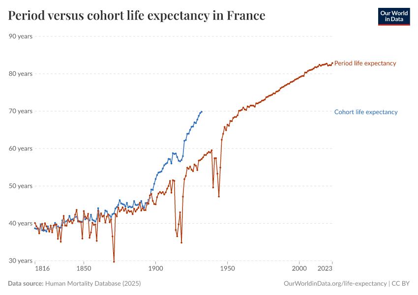
As you can see, cohort life expectancy (the actual average lifespan) is higher than period life expectancy. This is because period life expectancy is calculated by assuming people will experience the current year’s mortality rates at each age at the corresponding ages in their lifetime.
But in reality, mortality rates declined throughout the 20th century, so people actually lived longer than what’s implied by period life expectancy.7
Another reason for the difference is that period life expectancy is partly a reflection of conditions of the past that continue to affect older generations’ death rates today.8
You can also see that the trendline of cohort life expectancy ends decades ago. It can only be measured retrospectively, because researchers need to wait for data on deaths of the population who were born more recently.
Ages at death, death rates, and other measures
We can also calculate other metrics using either period or cohort measures.
For example, we might be interested in the modal age at death, which is the most common age at which people die in a given year.9
The modal age at death can be measured as a period indicator – where it refers to the most common age at which people died in 2019, for example. Or as a cohort rate – where it refers to the most common age at which people died, among those born in the same year.
Many other measures can also be described with period or cohort data.
This includes the age-specific mortality profiles, which are the death rates across age groups.
Age-specific mortality profiles can be calculated from a time period, for example, death rates in different age groups during a particular year.
Or they can be tracked for a cohort, where they refer to the death rates at different ages of a given birth cohort as they have grown older over time.
In the chart, you can see a comparison between period and cohort age mortality profiles. The horizontal axis shows the age, and the vertical axis shows the share of people of that age who died that year.
The data comes from France and covers the entire population.10
As you can see, period mortality profiles show death rates across age groups in a particular year. Death rates were elevated in 1918 and 1940, across youth and middle aged adults, due to the two World Wars and the 1918 Spanish flu pandemic.
This period measure is useful because it tells us how different age groups were affected during a specific period in time.
The cohort mortality profile shows death rates for people born in different cohorts, at different ages of their lives. You can see elevated death in those born in 1910, 1918 and 1920, across their youth and middle-age, due to the two World Wars and the 1918 Spanish flu pandemic.
This cohort measure is useful because it tells us how different generations experienced these events, and how mortality rates varied across their lifespans.
Period and cohort measures are also used for other topics, such as fertility rates, not only mortality data.11
What are period and cohort measures used for?
Period and cohort measures are used for different purposes.
The most appropriate choice depends on what you’re interested in and what data is available.
Period measures summarize data from a particular point in time. They can therefore be useful to understand the impact of immediate events, such as pandemics and wars. They can help answer the question: during these periods, which age groups were more likely to die?
Cohort measures track changes as people grow older. They can be used to understand death rates among a birth cohort as the group grows older.
They can also help to understand the historical experience that people have had. For cohorts born during the 1918 Spanish flu pandemic, for example, they can help us understand how it impacted their long-term survival.
Of course, cohort data is only available in retrospect and we need to wait many decades before full data becomes available. It is also more difficult to collect data across many years, decades, or even over a century and therefore is only available for relatively few populations.
In the visualization below, you can see a summary of the main points in this article.
Acknowledgements
Ilya Kashnitsky, Edouard Mathieu, Max Roser, and Fiona Spooner provided valuable feedback on this article.
Endnotes
We usually talk about birth cohorts – people born in the same year – but the term can be used for many kinds of groups: immigration cohorts, marriage cohorts, stroke survivors, university alumni, and so on. In this article, we’ll focus on birth cohorts.
This visualization was inspired by a diagram in the Office for Budget Responsibility’s report.
Office for Budget Responsibility. (2018, July). Period and cohort measures of fertility and mortality. https://obr.uk/box/period-cohort-measures-of-fertility-and-mortality/
See also:
Wilson, C., Sobotka, T., Williamson, L., & Boyle, P. (2013). Migration and Intergenerational Replacement in Europe. Population and Development Review, 39(1), 131–157. https://doi.org/10.1111/j.1728-4457.2013.00576.x
Jones, P. M., Minton, J., & Bell, A. (2023). Methods for disentangling period and cohort changes in mortality risk over the twentieth century: Comparing graphical and modelling approaches. Quality & Quantity, 57(4), 3219–3239. https://doi.org/10.1007/s11135-022-01498-3
In the Human Mortality Database, researchers have a threshold to wait until 99% of the relevant exposure data from a given cohort is available until making cohort estimates.
See section 7.2.2 in the Human Mortality Database full protocol v6.
Wilmoth, J. R., Andreev, K., Jdanov, D., Glei, D. A., Riffe, T., Boe, C., Bubenheim, M., Philipov, D., Shkolnikov, V., Vachon, P., Winant, C., & Barbieri, M. (2021). Methods protocol for the human mortality database (v6). https://www.mortality.org/File/GetDocument/Public/Docs/MethodsProtocolV6.pdf
In demography, it’s common to describe population sizes in 100,000 people instead. However, I’ve used 1,000 in this hypothetical example to make the numbers more digestible.
Guillot, M. (2011). Period Versus Cohort Life Expectancy. In R. G. Rogers & E. M. Crimmins (Eds.), International Handbook of Adult Mortality (Vol. 2, pp. 533–549). Springer Netherlands. https://doi.org/10.1007/978-90-481-9996-9_25
Canudas-Romo, V., & Schoen, R. (2005). Age-specific contributions to changes in the period and cohort life expectancy. Demographic Research, 13, 63–82. https://doi.org/10.4054/DemRes.2005.13.3
Vaupel, J. W. (2002). Life expectancy at current rates vs. Current conditions: A reflexion stimulated by Bongaarts and Feeney’s “How long do we live?” Demographic Research, 7, 365–378. https://doi.org/10.4054/DemRes.2002.7.8
Oeppen, J., & Vaupel, J. W. (2002). Broken Limits to Life Expectancy. Science, 296(5570), 1029–1031. https://doi.org/10.1126/science.1069675
Vaupel, J. W. (2002). Life expectancy at current rates vs. Current conditions: A reflexion stimulated by Bongaarts and Feeney’s “How long do we live?” Demographic Research, 7, 365–378. https://www.demographic-research.org/volumes/vol7/8/7-8.pdf
Missov, T. I., Lenart, A., Nemeth, L., Canudas-Romo, V., & Vaupel, J. W. (2015). The Gompertz force of mortality in terms of the modal age at death. Demographic Research, 32, 1031–1048. https://doi.org/10.4054/DemRes.2015.32.36
Horiuchi, S., Ouellette, N., Cheung, S. L. K., & Robine, J.-M. (2013). Modal age at death: Lifespan indicator in the era of longevity extension. Vienna Yearbook of Population Research, 37–69. https://www.jstor.org/stable/43050796
Missov, T. I., Lenart, A., Nemeth, L., Canudas-Romo, V., & Vaupel, J. W. (2015). The Gompertz force of mortality in terms of the modal age at death. Demographic Research, 32, 1031–1048. https://doi.org/10.4054/DemRes.2015.32.36
To recreate this chart, or create it for other countries, the scripts are available online.
For example, researchers can measure the total fertility rate (TFR) as a period measure. It represents the average fertility for a hypothetical group of women in a given year, if they experienced the same age-specific fertility rates throughout their whole lives as the age-specific fertility rates seen in that particular year.
But TFR can also be measured as a cohort measure – where it represents the average number of children born to women in that cohort by the end of their reproductive lives.
This distinction is important because period TFR can be influenced by the timing of childbearing and can therefore fluctuate due to trends such as women choosing to have children later in life.
Bongaarts, J., & Feeney, G. (1998). On the Quantum and Tempo of Fertility. Population and Development Review, 24(2), 271. https://doi.org/10.2307/2807974
In addition, demographers can also calculate hybrid measures from both period and cohort.
See for an example: Wilson, C., Sobotka, T., Williamson, L., & Boyle, P. (2013). Migration and Intergenerational Replacement in Europe. Population and Development Review, 39(1), 131–157. https://doi.org/10.1111/j.1728-4457.2013.00576.x
Cite this work
Our articles and data visualizations rely on work from many different people and organizations. When citing this article, please also cite the underlying data sources. This article can be cited as:
Saloni Dattani (2023) - “Period versus cohort measures: what’s the difference?” Published online at OurWorldinData.org. Retrieved from: 'https://archive.ourworldindata.org/20260518-093348/period-versus-cohort-measures-whats-the-difference.html' [Online Resource] (archived on May 18, 2026).BibTeX citation
@article{owid-period-versus-cohort-measures-whats-the-difference,
    author = {Saloni Dattani},
    title = {Period versus cohort measures: what’s the difference?},
    journal = {Our World in Data},
    year = {2023},
    note = {https://archive.ourworldindata.org/20260518-093348/period-versus-cohort-measures-whats-the-difference.html}
}
Reuse this work freely
All visualizations, data, and articles produced by Our World in Data are completely open access under the Creative Commons BY license. You have the permission to use, distribute, and reproduce these in any medium, provided the source and authors are credited.
The data produced by third parties and made available by Our World in Data is subject to the license terms from the original third-party authors. We will always indicate the original source of the data in our documentation, so you should always check the license of any such third-party data before use and redistribution.
All of our charts can be embedded in any site.