How experts use data to identify emerging COVID-19 success stories
How can we identify which countries have responded well to the Coronavirus pandemic? We look at the key metrics that help us identify success stories.
This article was published earlier in the COVID-19 pandemic, based on the latest published data at that time.
We now source data on confirmed cases and deaths from the WHO. You can find the most up-to-date data for all countries in our Coronavirus Data Explorer .
This is a guest post from epidemiologists David Kennedy, Anna Seale, and Daniel Bausch (UK Public Health Rapid Support Team), alongside Hannah Ritchie and Max Roser (Our World in Data) as part of the Exemplars in Global Health platform. 1
Introduction
EGH’s goal is to help inform current and future policies and programs in global health based on what has worked in the past. We do this by rigorously analyzing the success of countries that have made extraordinary progress. In the midst of a constantly evolving pandemic like COVID-19, it is not a simple matter to identify countries that have been most effective and therefore have the most to teach the rest of the world about best practices. Based on the current data, we developed a methodology to help us identify these emerging success countries. There are considerable limitations to the selection methodology due to the evolving nature of the pandemic including incomplete data, evolving case definitions, and the fact that the ultimate outcomes are unknown.
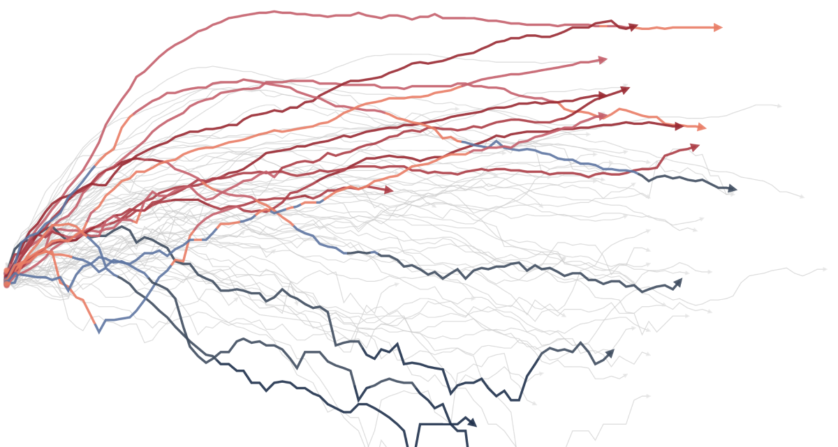
As you will see, it is not possible to identify emerging success stories, or exemplars, using just one indicator. Each data point has nuanced drivers and meanings, making it important to triangulate and look across multiple indicators to identify countries that have had success to date in managing the pandemic. The daily rates of confirmed deaths follow very different trajectories in countries. The steeper the slope of the curve, the faster the rate of increase in deaths. Countries at the top of the first graph below have had the most deaths, but some of those countries also have larger populations. The second graph below shows deaths per capita to account for differences in population. These graphs suggest that some responses have been much more effective at reducing deaths from COVID-19 than others, but they do not tell us why they are more effective.
Detect, Contain, Treat
To help shed light on why some responses are more effective, we initially started with a four-part framework for epidemic preparedness and response: prevention, detection, containment, and treatment. Because transmission of COVID-19 is ongoing, it is too soon to determine if any country will ultimately succeed at prevention, so we excluded the prevention phase from our analysis. We selected multiple indicators for the detection, containment, and treatment phases that could help us identify which countries are excelling at any given phase. This enables us to identify countries that show emerging success at each phase, which makes it more likely to glean detailed insights that will be useful for other countries.
On this page, we walk through a total of nine graphs addressing all three phases, describing what each graph can and cannot tell us about a country’s response. These graphs are updated daily, so the countries that stand out now might change over time. Some countries with early positive outcomes were unable to sustain their success, whereas the situations in other countries gradually improved. To see the results on any given day of the pandemic or to reflect any range of dates, adjust the slider bar below the graphs. This will turn single data points into line graphs.
Country Selection Criteria
To ensure that our process is rigorous and that other countries can use lessons from our exemplars, we applied the following three criteria to select countries for our analysis:
- We included only countries with populations greater than 5 million. This minimizes the likelihood that apparent trends are background noise in the data, and to ensure we can extract lessons applicable to the many large countries that are currently struggling to contain the pandemic.
- We included only countries in which at least 21 days had passed since the 100th confirmed case. We wanted to include only countries whose response had been going on long enough and with sufficient numbers of cases to be properly assessed, recognizing that in some countries, low prevalence may be the result of effective containment.
- We included only countries with high-quality data on testing, cases, and deaths. Many countries have been slow to publish testing data, preventing proper analysis at this time. Our testing database has been developed with a clearly documented checklist of criteria for inclusion; definitions and units; and detailed descriptions for each country so users can understand the comparability of data from different countries.
The number of countries meeting the second and third criteria will grow over time, increasing the number of countries that can be included in the analysis.
Detection Indicators
We selected three indicators for the detection phase, all of which are measured relative to population size: tests per capita, tests per confirmed case, tests per confirmed deaths.
The graph below shows the total number of COVID-19 tests performed per thousand people by country. Perhaps the biggest challenge in thinking about testing is that the number of tests performed depends on a country’s testing strategy—that is, how many people a country intends to test given its context. More tests is not necessarily better if, for example, a country has made a decision to focus on containment measures that do not require blanket testing.
In the early stages of an outbreak, containment may be possible by testing frequently to identify cases and trace contacts. However, once community transmission is widespread and containment is no longer possible, population-wide measures to reduce transmission are less dependent upon testing. If these measures are successful in reducing the spread, then case finding and contact tracing eventually become feasible again, and widespread testing again becomes critical.
The bar graph below shows the average number of tests performed per confirmed case. Countries with the highest ratio of tests to confirmed cases are likely to have a more accurate understanding of how many total (not just confirmed) cases they have.
Some testing strategies focus on high-risk groups such as health care workers or high-risk locations such as nursing homes. Strategies that focus on those at the highest risk will result in a lower number of tests performed per confirmed case, meaning countries will know less about of the true magnitude of the outbreak in the community at large.
The graph below shows the total number of tests performed and the total number of confirmed deaths, per million people in a country. In general, a high number of tests per death is preferable because it indicates widespread testing and assessment of community transmission. Considering the context, however, is especially important to ensure we are aware of what the data can and cannot tell us. In very large countries, for example, the evolution of the epidemic may vary across different cities and regions. Some outbreaks may be successfully contained, whereas others are not. These data do not show testing capacity at the sub-national level.
Containment Indicators
We selected four indicators for the containment phase, relative to the population size: cases per capita, cases doubling time, deaths per capita, deaths doubling time.
The graph below shows the total number of confirmed COVID-19 cases per million people. The number of cases, however, are dependent on a country’s testing capacity and strategy. Low numbers of cases could reveal successful containment or they could indicate an inability or choice not to test widely. A steep slope could indicate high levels of transmission, a rapid increase in testing capacity, or a change in testing strategy to include, for example, asymptomatic or mildly ill people.
A longer doubling time indicates a lower rate of transmission. The doubling time is less dependent on testing capacity as long as the capacity does not change over time—which it often does. We would consider a country with few confirmed cases and a long doubling time to be successfully containing the outbreak, although low testing capacity could still be a factor. In many cases a long doubling time may suggest that containment measures are starting to take effect. On the other hand, few cases and a short doubling time may suggest that the outbreak is spreading quickly, and the number of cases is set to increase.
Using the number of deaths when assessing containment has advantages and disadvantages. The number of deaths may be a more consistent measure than the number of cases, because they are less likely to vary with testing capacity or strategy. However, making international comparisons may be difficult because countries may have different rules for registering deaths due to COVID-19. For example, the total number of registered deaths appears high in Belgium, where all non-hospitalized people displaying symptoms of COVID-19 are included in the official coronavirus-related deaths figures, compared with other countries where only laboratory-confirmed cases are counted. One disadvantage to using data on deaths is that they depend to some extent on the demographics of a given country; for example, countries with many elderly people tend to have more deaths from COVID-19 per capita. Death rates may also depend on access to high-quality health care in a given country (see next section).
It is important to remember that deaths are a lagging indicator, since they generally occur two to three weeks after disease onset. Changes in the death doubling time could indicate that the quality of medical care is increasing or decreasing (see next section), or that the number of infections were entering or exiting their peak some weeks ago.
Treatment Indicators
We selected one indicator for the treatment phase: case fatality rate (CFR).
This phase is extraordinarily challenging to assess because the quality of the data depends on the accuracy of the case data, which in turn depends on testing capacity and strategy. In some countries where testing is effective, the number of confirmed cases may be close to the true number of infections. In other countries, the true number of infections is probably much higher than the number of confirmed cases. Eventually, we will be able to compare the less biased indicator of excess mortality, which measures how many more people died in a given country over a given period than was expected. We will also have better data about the true number of infections, which will allow us to use infection fatality rate (IFR). However, those data are not currently available for most countries.
The graph below shows CFR, which is the ratio of deaths to confirmed cases, or the proportion of people diagnosed who die from the disease. Our assumption is that countries with lower CFRs have more effective responses during the treatment phase. In countries where health systems were unable to meet increased demand for care, CFRs might increase, although we are unable to determine whether that has happened from this data set.
Analysis of CFR data comes with certain caveats. For example, if only the sickest people in a country are tested and therefore diagnosed, CFRs may be artificially high. CFRs may also be strongly influenced by the demographics of the population, with higher CFRs seen in countries where the population demographics are skewed toward groups who have a higher risk of death due to COVID-19, including older people or people with other health problems, such as diabetes and hypertension.
The graph below shows CFR broken out to show the total number of confirmed deaths from COVID-19 versus the total number of cases. This comparison helps provide more context about the drivers of CFR. If the CFR is high, is that because deaths are high or because cases are low? Conversely, if the CFR is low, is that because deaths are low or cases are high?
Country Selection
In early May 2020, we surveyed the countries that appeared to be controlling the outbreak by each indicator and phase as discussed above. Once we had the quantitative results, we also considered diversity and representativeness (e.g., demographics, form of government, geographic features, or global region).
As a result of this analysis, we selected three countries as exemplars to study in greater depth: Germany, South Korea, and Vietnam. More details on this analysis and how these countries were selected will be included soon.
In addition to these three countries, we will continue to refine our methodology and identify more exemplar countries as the pandemic evolves and as more and higher-quality data are available. For example, many African countries did not meet our inclusion criteria because transmission is still less widespread in those countries, but unfortunately that may change soon.
The charts and graphs are updated daily. Our approach and graphs are intended as tools for you to run your own data analysis to seek answers to your specific questions.
Limitations
We recognize several limitations to this country selection process. The dynamics of the COVID-19 pandemic are different in each country, are evolving at different rates, and at times are dependent on factors beyond the country’s control. These factors include the population density and patterns of geographic dispersion, the number of borders shared with other countries, the number of air and land travel entry points, and the volume of travelers and trade. For example, the challenges of controlling an outbreak in an island country like New Zealand are much different than in Switzerland, a country in the geographic heart of Europe that shares land borders with five countries, with daily border crossings from all sides.
In-depth explainers on Exemplar countries
This framework identified three countries which provide key success stories in addressing the pandemic: South Korea, Vietnam and Germany. In follow-up articles, in-country experts provide key insights into how these countries achieved this.

South Korea
Emerging COVID-19 success story: South Korea learned the lessons of MERS

Vietnam
Emerging COVID-19 success story: Vietnam's commitment to containment

Germany
Emerging COVID-19 success story: Germany's strong enabling environment
Endnotes
This article is one of a series focused on identifying and understanding Exemplars in the response to the Coronavirus pandemic. It is hosted by the Exemplars in Global Health (EGH) platform.
Exemplars in Global Health is a coalition of experts, funders, and collaborators around the globe, supported by Gates Ventures and the Bill & Melinda Gates Foundation, who share the belief that rigorously understanding global health successes can help drive better resource allocation, policy, and implementation decisions. The Exemplars in Global Health platform was created to help decision-makers around the world quickly learn how countries have solved major health and human capital challenges.
Cite this work
Our articles and data visualizations rely on work from many different people and organizations. When citing this article, please also cite the underlying data sources. This article can be cited as:
Guest Authors (2020) - “How experts use data to identify emerging COVID-19 success stories” Published online at OurWorldinData.org. Retrieved from: 'https://ourworldindata.org/identify-covid-exemplars' [Online Resource]BibTeX citation
@article{owid-identify-covid-exemplars,
    author = {Guest Authors},
    title = {How experts use data to identify emerging COVID-19 success stories},
    journal = {Our World in Data},
    year = {2020},
    note = {https://ourworldindata.org/identify-covid-exemplars}
}
Reuse this work freely
All visualizations, data, and code produced by Our World in Data are completely open access under the Creative Commons BY license. You have the permission to use, distribute, and reproduce these in any medium, provided the source and authors are credited.
The data produced by third parties and made available by Our World in Data is subject to the license terms from the original third-party authors. We will always indicate the original source of the data in our documentation, so you should always check the license of any such third-party data before use and redistribution.
All of our charts can be embedded in any site.


