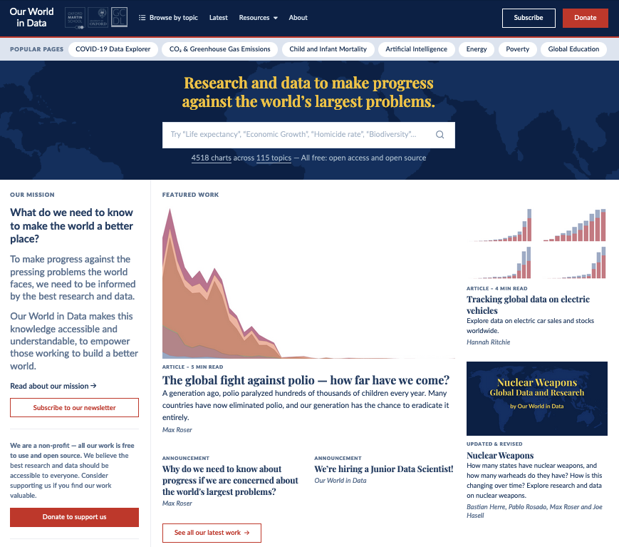
We’ve redesigned our homepage
Here’s what’s changed, what hasn’t, and some of the thinking behind the new design.
To make progress against the pressing problems the world faces, we need to be informed by the best research and data. Our World in Data’s mission is to make this knowledge accessible and understandable and to empower those working to build a better world.
We cover a wide range of topics on our site: global health, energy and environment, poverty, food, technology, democracy, education, and many more. A recurring question for us is how to present this work clearly and help users reach the information they are looking for quickly.
Today we’re launching a redesigned homepage as part of this effort.

What’s changed?
Richer content. We’ve increased the amount of featured content we can link to within the homepage, to showcase the breadth of our data, research, and writing, and provide a quick path to our latest and most popular work.
Clearer structure. To help users navigate our work, we’ve added a more prominent search bar at the top and a list of all the topics we cover further below. The new layout also clarifies the different kinds of content we publish: articles, topic pages, and interactive data visualizations.
Data front and center. Interactive visualizations are core to our work of making data and research accessible and understandable. We’ve selected a few of our most important indicators to showcase the Our World in Data “Grapher”, our main interactive visualization tool, now visible on the homepage for the first time.
Consistent design. The new homepage has been brought up-to-date with our new design system, giving a more consistent visual feel across the site.
What hasn’t changed?
Popular ways to find our work. We know that two navigational elements — the search bar and the “Browse by topic” dropdown in the header — are popular ways for our users to quickly find the work they’re looking for. You can still find them there.
The structure and mission of our work are the same. Everything else across Our World in Data works as before — and, of course, our mission remains the same.
Why have we redesigned the homepage?
Our World in Data is a content-rich publication, with a lot of text and thousands of charts on over a hundred topics. Different users navigate this work differently: some like to browse the breadth of our work, topic by topic; some search for specific data or writing quickly; others prefer to be guided by our featured content. With our new homepage design, we’ve tried to make each of these paths smoother, to bring our users closer to the full range of our work.
For our content-rich publication, we also wanted to have more spaces to curate a selection of our work that can change over time and give our readers a good overview of the research and data they can find on Our World in Data.
As always, if you have feedback on the new design or any other aspect of our work, you can contact us at info@ourworldindata.org or via our Feedback form.
Reuse this work freely
All visualizations, data, and code produced by Our World in Data are completely open access under the Creative Commons BY license. You have the permission to use, distribute, and reproduce these in any medium, provided the source and authors are credited.
The data produced by third parties and made available by Our World in Data is subject to the license terms from the original third-party authors. We will always indicate the original source of the data in our documentation, so you should always check the license of any such third-party data before use and redistribution.
All of our charts can be embedded in any site.

