Gdoc/Admin

Popular pages

Research and data to make progress against the world’s largest problems.

13,218 charts across 119 topicsAll free: open access and open source

Our Mission

What do we need to know to make the world a better place?

To make progress against the pressing problems the world faces, we need to be informed by the best research and data.

Our World in Data makes this knowledge accessible and understandable, to empower those working to build a better world.

Read about our mission

We are a non-profit — all our work is free to use and open source. Consider supporting us if you find our work valuable.

Donate to support us
As seen on
Logos of the publications that have used our content. From left to right: Science, Nature, PNAS, BBC, Financial Times, The New York Times, The Guardian, The Atlantic, and The Washington Post

Daily Data Insights

Bite-sized insights on how the world is changing, published every weekday.

See all Daily Data Insights
Line chart showing the share of electricity produced from solar and wind in Spain and Portugal. Both countries got around 40% from these sources in 2023.

Spain and Portugal both get 40% of their electricity from solar and wind

European neighbors Portugal and Spain are currently neck-and-neck in the race to roll out solar and wind power.

On the chart, you can see the share of electricity from the combination of solar and wind in each country. Their rate of progress has been very similar.

In 2023, both countries generated around 40% of their electricity from these sources. Wind power is more prevalent in Portugal, while solar is more used in Spain.

This data comes from Ember.

Explore more data on the rollout of clean energy across the world →

Continue reading
Line chart showing global mean sea level rise since 1880. It has increased by around 25 centimeters.

Global mean sea levels have increased by around 25 centimeters since 1880

There are two key drivers of sea level rise. First, water expands as it gets warmer. Second, ice on land — in the form of ice sheets and glaciers — melts and adds water to ocean basins.

Both of these processes have accelerated due to climate change. The effect is shown in the chart, based on data from the US’s National Oceanic and Atmospheric Administration. It combines two sources: recent data from the University of Hawaii Sea Level Center and a publication from Church and White (2011).

On this chart, the rise in sea level is measured relative to the average from 1993 to 2008. Levels had risen by almost 20 centimeters between 1880 and this period, and 5 more centimeters since. Combined, that’s around 25 centimeters.

Explore more data on the impacts of climate change →

Continue reading
Bar chart showing where carbon emissions from food miles come from. Road transport is 3.9% of food system emissions, compared to just 0.02% from aviation.

Most carbon emissions from food miles are produced by trucks on the road

Food miles — moving products from farms to processors to consumers — contribute just 5% to 6% of the greenhouse gas emissions from food. Instead, most emissions come from land use change or emissions on the farm.

Within food miles, people often assume that international freight accounts for most of the climate impact. In reality, most of these emissions come from domestic delivery trucks on the road.

In the chart, you can see the breakdown of transport’s 5% of food emissions. Road transport represents 3.9%, compared to just 0.02% from aviation. This is based on data from a 2021 study by researchers M. Crippa and colleagues.

International food miles are just a small share of emissions because very little food is flown by air, and transporting goods by boat is much more carbon-efficient than by road.

Read more about the impact of food miles →

Continue reading

The global number of people aged 65 years and older is set to double within the next thirty years

Today, there are around 830 million people aged 65 and older in the world. According to the latest UN data, it is projected to grow to 1.7 billion by 2054.

Asia, the world's most populous continent, is at the heart of this change, with its elderly population expected to more than double.

While rapid population growth has driven some of this increase, better healthcare and longer life spans also play a huge role.

It’s a great achievement that so many more people are living longer, healthier lives. At the same time, the working-age population will only grow 20% between 2024 and 2054. Societies will need to figure out how to care for more elderly people while improving everyone’s quality of life.

Explore population growth across countries with our explorer →

Continue reading
Packaging is the source of 40% of the planet’s plastic waste

Packaging is the source of 40% of the planet’s plastic waste

Around 40% of the world’s plastic waste comes from packaging. Packaging also makes up a significant share in the three regions that generate the most plastic waste: the United States, Europe, and China.

Packaging accounts for 37% of total plastic waste in the United States. It’s 38% in Europe, and in China, it's 45%. Together, these regions account for 60% of global packaging waste generation. This data comes from the OECD Global Plastics Outlook.

These figures show the vast impact of packaging on global plastic waste.

Explore how other sectors contribute to plastic waste production

Continue reading
A line chart showing the change in the electricity mix of Australia over time. Coal power has declined from over 80% to less than 50%. Solar and wind are growing strongly.

Australia is replacing coal and gas power with solar and wind

At the turn of the millennium, Australia got more than 80% of its electricity from coal. This has dropped to less than 50%.

The chart shows how the country’s electricity mix has changed in recent decades. The data comes from the Energy Institute’s Statistical Review of World Energy.

In the 2000s and early 2010s, coal was initially replaced by gas, with only moderate growth in solar and wind. But in the last five years, solar and wind have been deployed much more quickly. Gas is now on the decline, too. In 2023, solar overtook gas to become Australia’s second-largest electricity source.

While coal is declining, it still supplies much more of Australia’s power than most high-income countries.

Explore how electricity sources are changing in other countries →

Continue reading
Cancer is one of the most common causes of death worldwide. In several countries, it is the most common cause of death.
But which cancer types cause the most deaths?
The map presents the most common type of cancer death among women. This is based on the cause listed on death certificates, compiled by the WHO Mortality Database. Unfortunately, many countries are not shown as they lack sufficient death registration.
Breast cancer is the leading cause of cancer death in many countries.
However, lung cancer leads in parts of North America, Europe, and Australia. It is largely driven by smoking.
In other countries, stomach, liver, or cervical cancers lead. Many cases are preventable: most stomach cancer cases are caused by H. pylori infections; most liver cancers by chronic inflammation from alcohol or hepatitis infections; and almost all cervical cancers are caused by HPV infections, which are preventable through HPV vaccination.

Which type of cancer kills the most women in each country?

Cancer is one of the most common causes of death. But which cancer types cause the most deaths?

The map presents the most common type of cancer that kills women in each country. This is based on the cause listed on death certificates, compiled by the WHO Mortality Database. Unfortunately, many countries are not shown as they lack sufficient death registration.

Breast cancer is the leading cause of cancer death in many countries.

However, lung cancer leads in parts of North America, Europe, and Australia. It is primarily driven by smoking.

In other countries, stomach, liver, or cervical cancers are at the top. Many of these cases are preventable: most stomach cancer cases are caused by H. pylori infections; many liver cancer cases by chronic inflammation from alcohol or hepatitis infections; and almost all cervical cancers are caused by HPV infections, which are preventable through HPV vaccination.

Explore the interactive map with a more detailed breakdown

Continue reading

Get Daily Data Insights delivered to your inbox

Receive an email from us when we publish a Daily Data Insight (every weekday).

By subscribing you are agreeing to the terms of our privacy policy.

Explore our data

Featured data from our collection of 13,218 interactive charts.

See all our data

What share of children die before their fifth birthday?

What could be more tragic than the death of a young child? Child mortality, the death of children under the age of five, is still extremely common in our world today.

The historical data makes clear that it doesn’t have to be this way: it is possible for societies to protect their children and reduce child mortality to very low rates. For child mortality to reach low levels, many things have to go right at the same time: good healthcare, good nutrition, clean water and sanitation, maternal health, and high living standards. We can, therefore, think of child mortality as a proxy indicator of a country’s living conditions.

The chart shows our long-run data on child mortality, which allows you to see how child mortality has changed in countries around the world.

Explore and learn more about this data

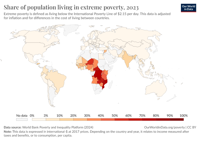
Share of population living in extreme povertyWorld Bank

Life expectancy at birthLong-run estimates collated from multiple sources by Our World in Data

Per capita CO₂ emissionsLong-run estimates from the Global Carbon Budget

GDP per capitaLong-run estimates from the Maddison Project Database

Share of people that are undernourishedFAO

Literacy rateLong-run estimates collated from multiple sources by Our World in Data

Share of the population with access to electricityWorld Bank

Data explorers

See all our Data Explorers

Interactive visualization tools to explore a wide range of related indicators.

Subscribe to our newsletters

Receive our latest work by email.
By subscribing you are agreeing to the terms of our privacy policy.

All our topics

All our data, research, and writing — topic by topic.

Population and Demographic Change

Health

Energy and Environment

Food and Agriculture

Poverty and Economic Development

Education and Knowledge

Innovation and Technological Change

Living Conditions, Community, and Wellbeing

Human Rights and Democracy

Violence and War