How unequal were pre-industrial societies?
Research by Milanovic, Lindert, and Williamson gives us some insight into how incomes were distributed in the distant past.
Thanks to data from household surveys and income tax records, we have a good understanding of the extent of inequality in many countries today, and how this has changed over the past decades or even the past century. But how unequal were pre-industrial societies?
To answer this question, Milanovic, Lindert, and Williamson investigated the estimates for levels of pre-industrial inequality in their 2008 paper “Ancient Inequality”. Most of their estimates (18 of the 28) of pre-industrial inequalities are based on so-called “social tables”. In these tables, social classes (or groups) “are ranked from the richest to the poorest with their estimated population shares and average incomes”.1
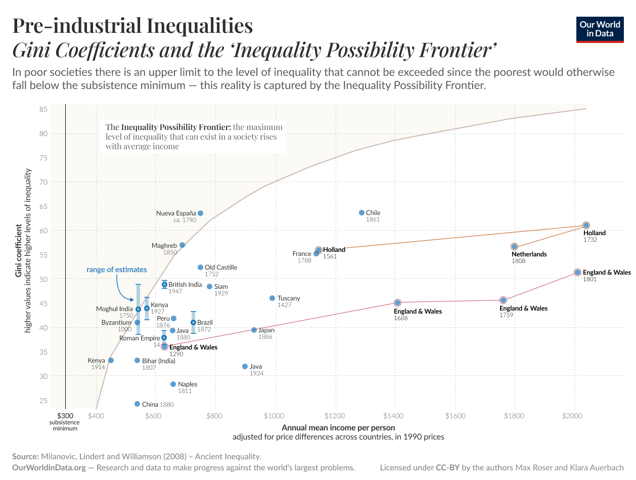
The following chart shows the level of economic inequality in pre-industrial societies compared to the levels of prosperity in those same societies. Inequality is measured with the Gini coefficient, and prosperity is measured by the gross domestic income per capita, adjusted for price differences to make comparisons possible.
The chart also shows a curve which the authors call the “Inequality Possibility Frontier” (IPF). The idea behind this curve is that in a very poor society, inequality cannot be very high. Imagine if the average income level were just the bare minimum to survive. In such an economy, there could not possibly be any inequality as this would necessarily mean that some people have to be below the minimum income level on which they could survive.
When the average income is a little higher, it is possible to have a small level of inequality. And at higher incomes the possible level of inequality can be higher still. The IPF shows how the maximum possible inequality increases with a higher average income.
The authors found that many pre-industrial societies are clustered along the IPF. This means that in these societies, inequality was as high as it possibly could have been.
In the cases of Holland and England, we see that during their early development, they moved away from the IPF, and the level of inequality was no longer at the maximum.
Pre-industrial inequalities: Gini coefficients, and the Inequality Possibility Frontier2

Endnotes
Cited from Milanovic, Lindert, and Williamson (2008) – Ancient Inequality. In The Economic Journal. Volume 121, Issue 551, pages 255–272, March 2011. Online here. A short version that is freely available was published on VoxEU online here.
The data for this are taken from Milanovic, Lindert and Williamson (2008) – Ancient Inequality. In The Economic Journal. Volume 121, Issue 551, pages 255–272, March 2011. Online here. A short version was published on VoxEU online here. Notes related to this graph: the solid IPF line is constructed assuming that the annual subsistence minimum is $PPP 300. The Gini index is estimated using the estimated within-class income inequality (the Gini 2 in the original paper).
Cite this work
Our articles and data visualizations rely on work from many different people and organizations. When citing this article, please also cite the underlying data sources. This article can be cited as:
Max Roser (2013) - “How unequal were pre-industrial societies?” Published online at OurWorldInData.org. Retrieved from: 'https://ourworldindata.org/how-unequal-were-pre-industrial-societies' [Online Resource]BibTeX citation
@article{owid-how-unequal-were-pre-industrial-societies,
    author = {Max Roser},
    title = {How unequal were pre-industrial societies?},
    journal = {Our World in Data},
    year = {2013},
    note = {https://ourworldindata.org/how-unequal-were-pre-industrial-societies}
}
Reuse this work freely
All visualizations, data, and code produced by Our World in Data are completely open access under the Creative Commons BY license. You have the permission to use, distribute, and reproduce these in any medium, provided the source and authors are credited.
The data produced by third parties and made available by Our World in Data is subject to the license terms from the original third-party authors. We will always indicate the original source of the data in our documentation, so you should always check the license of any such third-party data before use and redistribution.
All of our charts can be embedded in any site.

